Poor Mobile Experience & Non-Responsive Layouts
- ✗ Tap targets placed too close
- ✗ Content wider than screen
- ✗ Small font sizes (9px)
What Is Poor Mobile Experience?
Poor mobile experience occurs when a website layout fails to adapt, load quickly, or function correctly on smartphone and tablet screens.
When a website lacks fluid responsive CSS columns, visual elements overlap, menus clip, and forms are difficult to tap. These usability bottlenecks confuse visitors, increase bounce rates, and directly reduce B2B lead generation potential over mobile networks.
Key Characteristics Of Mobile Usability
A high-quality mobile layout system relies on five core attributes:
Viewport Responsiveness
Layout components dynamically scaling to fit mobile displays without horizontal scrollbars.
Interactive Element Spacing
Structuring tap targets with at least 8px of padding to avoid accidental clicking errors.
Mobile Page Speed
Compressing visual assets and deferring unnecessary scripts to load fast over cellular networks.
Text Readability
Using typography scales (minimum 16px font-size) to ensure high readability on narrow displays.
Mobile Form Optimization
Single-column text inputs designed with clear labels that prevent auto-zoom scaling bugs.
Signs Of Poor Mobile Experience
A non-responsive website displays warning indicators that direct code checks should resolve:
Text Difficult To Read
Tiny text sizes require mobile users to manually zoom in or scroll horizontally to read paragraphs.
Buttons Difficult To Tap
Interactive elements placed too close together cause accidental tap errors on mobile devices.
Slow Mobile Loading
Pages loading sluggishly over mobile data networks due to uncompressed layout assets.
Broken Layouts
Grid columns wrapping incorrectly, visual content overlapping, or menu links sliding off-screen.
Poor Navigation
Menu options and dropdown tabs failing to render correctly on mobile phone browsers.
Mobile Form Issues
Multi-step fields and input grids zooming unpredictably, preventing form completion.
Common Causes Of Poor Mobile Experience
Mobile experience degradation stems from basic technological and layout gaps:
Non Responsive Design
Using fixed-width tables or layout containers that fail to adapt fluidly to small screen sizes.
Large Images
Uploading massive raw media assets that consume significant bandwidth over mobile connections.
Poor Layout Structure
Failing to format hierarchical menu bars, resulting in overlapping visual components on phone screens.
Legacy Website Technology
Relying on deprecated systems that lack responsiveness or display errors on mobile devices.
Unoptimized Mobile Forms
Creating wide input forms that trigger screen zooming and complicate data entry.
How Poor Mobile Experience Affects Businesses
Accessibility issues on mobile viewports negatively affect B2B operational success:
Higher Bounce Rates
Visitors instantly exit your site if it fails to render correctly on mobile displays.
Reduced Engagement
Users interact with fewer pages if horizontal scrollbars or slow load speeds make layout navigation difficult.
Lost Enquiries
Complicated mobile forms cause prospects to abandon lead submission processes.
Poor User Satisfaction
Failing to support easy mobile access leads to friction, undermining client relationship potential.
Reduced Conversion Opportunities
Underperforming layouts fail to guide mobile visitors to primary call-to-actions.
Industries Commonly Affected
Mobile usability issues create operational friction across various industries:
Educational Institutions
Students access timetables and notices primarily via mobile; non-responsive systems disrupt academic communications.
Healthcare Providers
Patients booking appointments on-the-go require simple mobile forms; complex layouts result in lost patient contacts.
Real Estate Businesses
Property listings and maps must render cleanly on smartphones, supporting local buyer search needs.
Professional Services
Consulting firms depend on mobile visitors reading case studies; broken typography reduces professional authority.
Local Businesses
Customers locate services while traveling; non-responsive maps or contact links limit local search conversions.
How To Improve Mobile Experience
A structured framework is used to optimize your website for mobile viewports:
Usability Audit
Identify layout breakages and tap target errors.
Grid Setup
Structure responsive CSS container layout grids.
Text Calibration
Adjust font weights and margins for phone viewports.
Media Compress
Convert images to WebP and set size attributes.
Forms Audit
Streamline inputs and touch points for easy logs.
Usability Audit
Identify layout breakages and tap target errors.
Deliverable: Mobile audit reportGrid Setup
Structure responsive CSS container layout grids.
Deliverable: Responsive gridText Calibration
Adjust font weights and margins for phone viewports.
Deliverable: Optimized typographyMedia Compress
Convert images to WebP and set size attributes.
Deliverable: Compressed filesForms Audit
Streamline inputs and touch points for easy logs.
Deliverable: Mobile-friendly formsHow To Prevent Poor Mobile Experience
A proactive updates approach maintains design responsive longevity:
Cross-Device Testing
Test layout display correctness regularly across standard iOS, Android, and tablet screens.
Visual Compression Policies
Convert all new visual asset uploads to WebP formats, restricting image sizes below 150KB.
Tap Target Auditing
Maintain 48x48px interactive target areas on menu listings, buttons, and inline text links.
Performance Monitoring
Audit mobile Core Web Vitals (LCP, INP, CLS) weekly using search engine diagnostics tools.
Related Website Services
Explore our B2B visual redesign and custom WordPress development service nodes:
Website Redesign
Modernizing static platforms to provide 100% fluid responsive grids and touch-friendly layouts.
Landing Page Design
Designing conversion-focused landing pages optimized specifically for mobile campaign leads.
WordPress Website Design
Building custom WordPress installations that support modular editing and fast mobile loading speeds.
Real Project Example From Our Portfolio
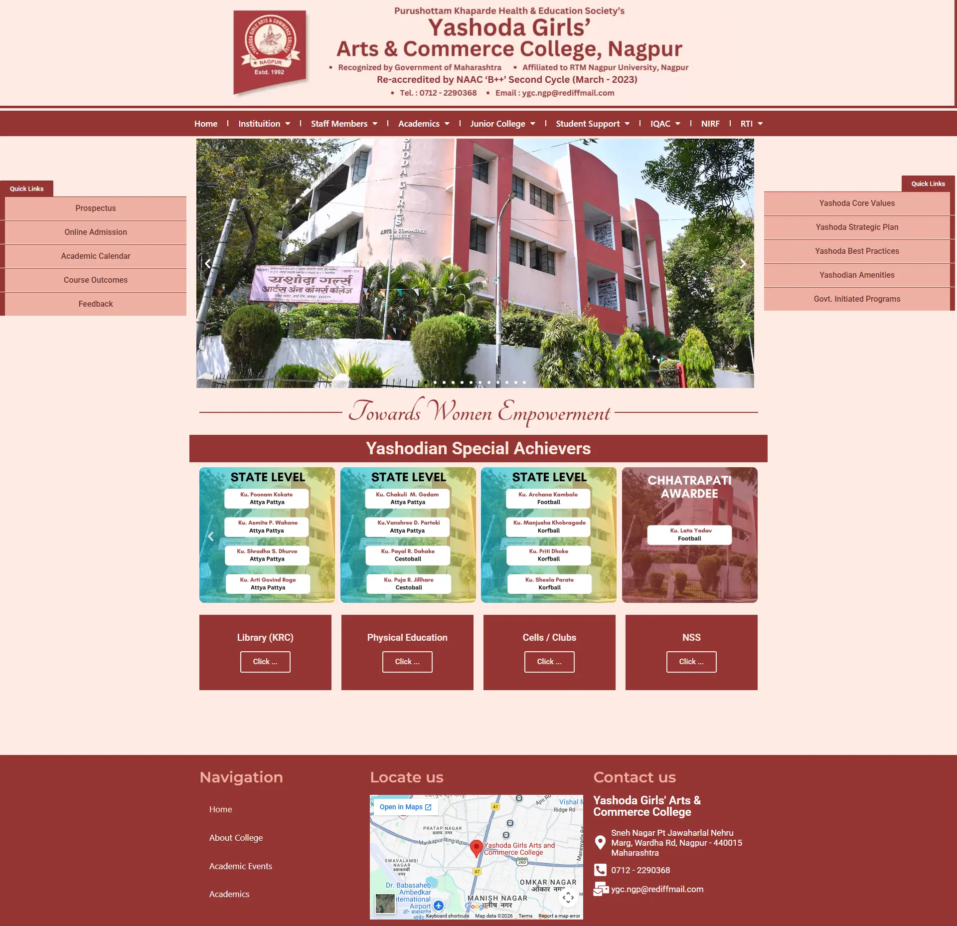
Non-Responsive Static PHP Structure
Yashoda Girls' College used an outdated static site built with old tables, rendering with massive layout breakages and zero readability on smartphone screens.
WordPress Migration & Mobile Responsive Rebuild
Migrated the legacy pages scope to WordPress, coded fluid responsive column grids, and built a structured directory for academic notices and files uploads.
100% Mobile Access & Easier Notices Uploads
Full portal readability on smart viewports, allowing administrative staff to upload PDFs independently and keep notices accurate.
Related Website Challenges
Explore other common performance, accessibility, and technology challenges affecting business websites:
Website Security Issues
Malware infections, unpatched database gates, and security warnings blockading access.
Outdated Website
Older layouts, legacy CMS platforms, and poor accessibility decreasing conversions.
Slow Website
Unoptimized resource loading, poor caching, and database blocks driving visitors away.
Frequently Asked Questions
Find answers to common mobile-first, responsiveness, and display queries:
Why is mobile responsiveness so important for B2B websites? +
Over 50% of all web traffic comes from mobile devices. If a B2B decision-maker accesses your website on a phone and encounters broken layout grids, they will immediately leave and visit a competitor.
What is mobile-first design? +
It is a development approach where layouts are designed for the smallest mobile screen sizes first, then scaled up to tablet and desktop viewports, ensuring fast loading and tap targets accessibility.
How do large unoptimized images affect mobile performance? +
Large image files consume significant bandwidth over mobile networks. Deferring scripts and converting visuals to WebP format is essential to avoid sluggish page loads.
Can Google index a website if it lacks mobile responsiveness? +
Google uses mobile-first indexing. It primarily evaluates the mobile version of your pages to determine rankings; if your mobile interface is broken, your search rankings will drop.
What is a tap target overlap warning in Google Search Console? +
It is a mobile usability warning indicating that buttons or links are placed too close together (less than 8px apart), making it difficult for smartphone users to tap them without errors.
How do I make my website's forms mobile-friendly? +
Use single-column layouts, optimize input field padding, ensure touch targets are large enough, use appropriate keyboard input types, and disable auto-zoom configurations that lock viewports.
Does website speed affect mobile conversion rates? +
Yes. Over 50% of mobile users abandon pages that take longer than 3 seconds to load. Slow loading directly reduces user satisfaction and leads to lost inquiries.
What is a viewport meta tag? +
It is a layout configuration tag in your HTML head that instructs mobile browsers to scale your website layout to match the device screen width, preventing layout scaling breaks.
Can I improve mobile experience without a complete redesign? +
Minor bugs like text size can be patched. However, transforming a non-responsive static structure requires rebuilding the frontend using fluid responsive CSS grids.
How does mobile usability affect customer trust? +
A professional, fast, and easy-to-use mobile layout suggests business modernism and client focus, supporting B2B conversion potential and local visibility.
Request A Free Website Audit
Does your website render incorrectly on smartphones or tablet viewports? Request a responsive checks audit.
View All Services HubAudit Request Submitted
Thank you! I will review your website responsive coordinates and send your custom audit report within 24 hours.